
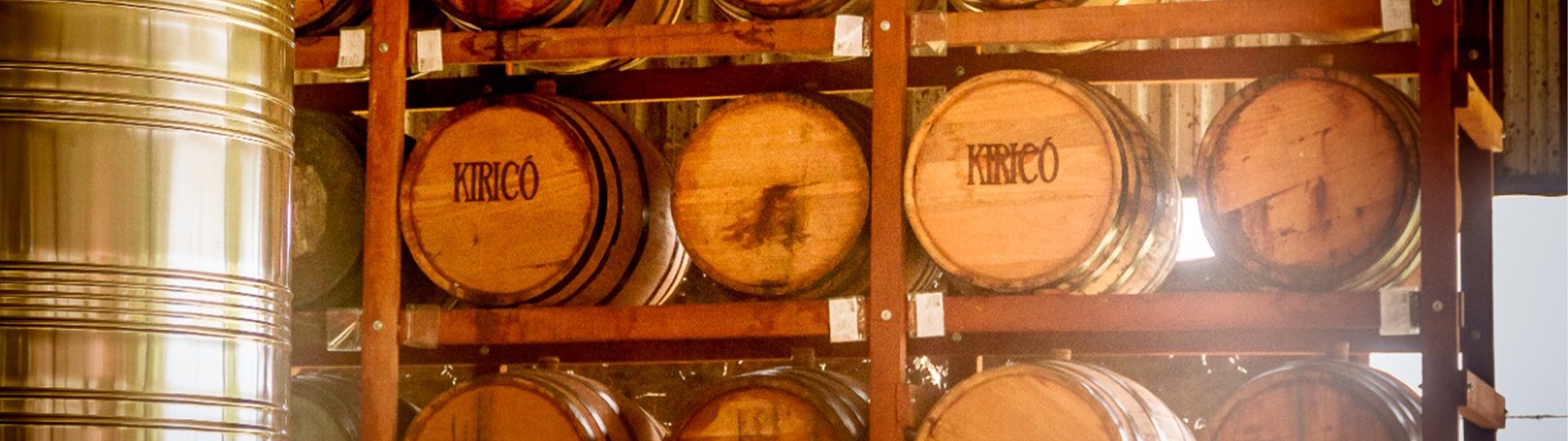
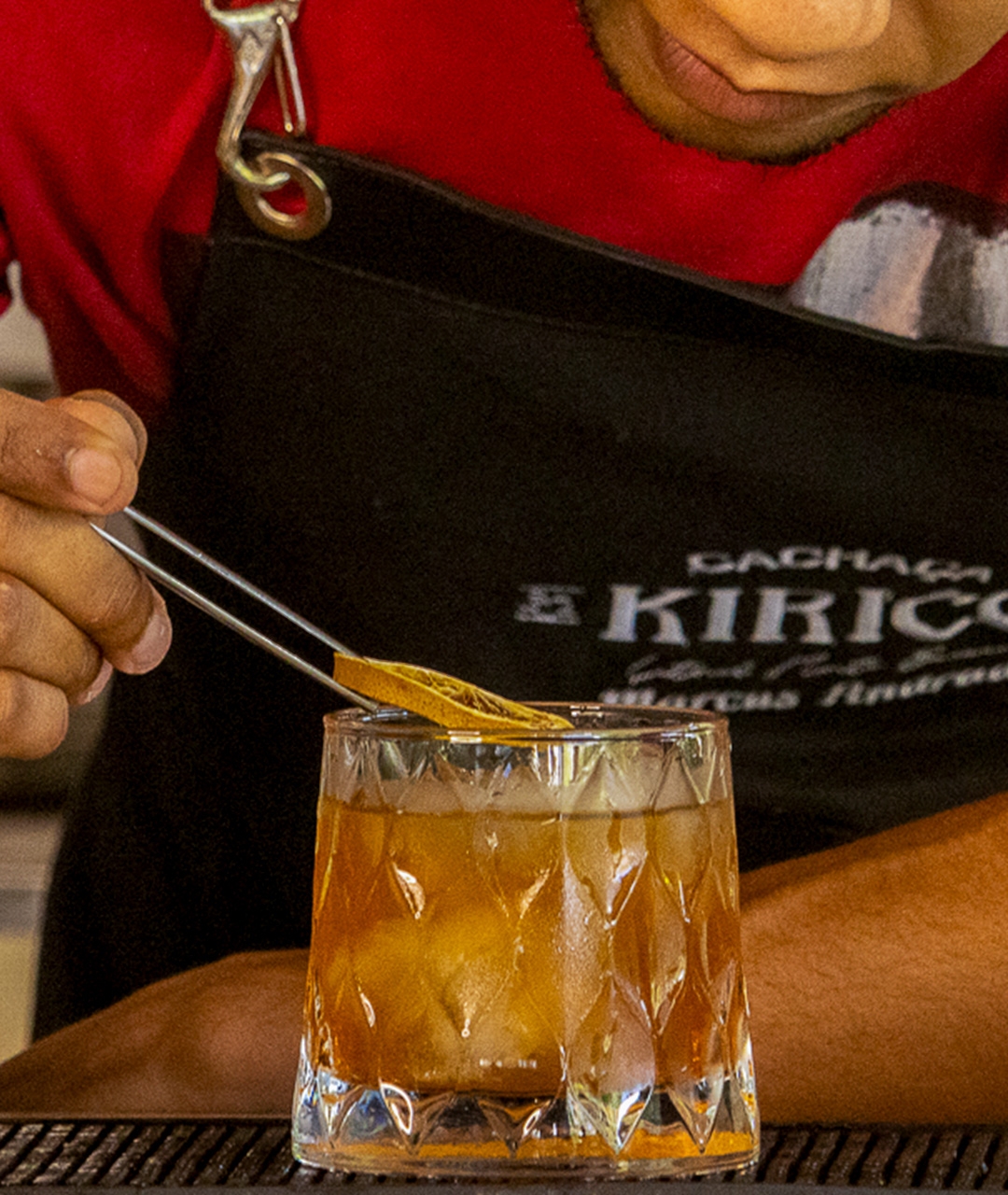
Kiricó, an artisanal cachaça brand, celebrates nature through family farming and partnerships with quilombola and indigenous communities.

The brand's redesign expresses the company's growth and connects the drink with enthusiasts of unique sensory experiences.
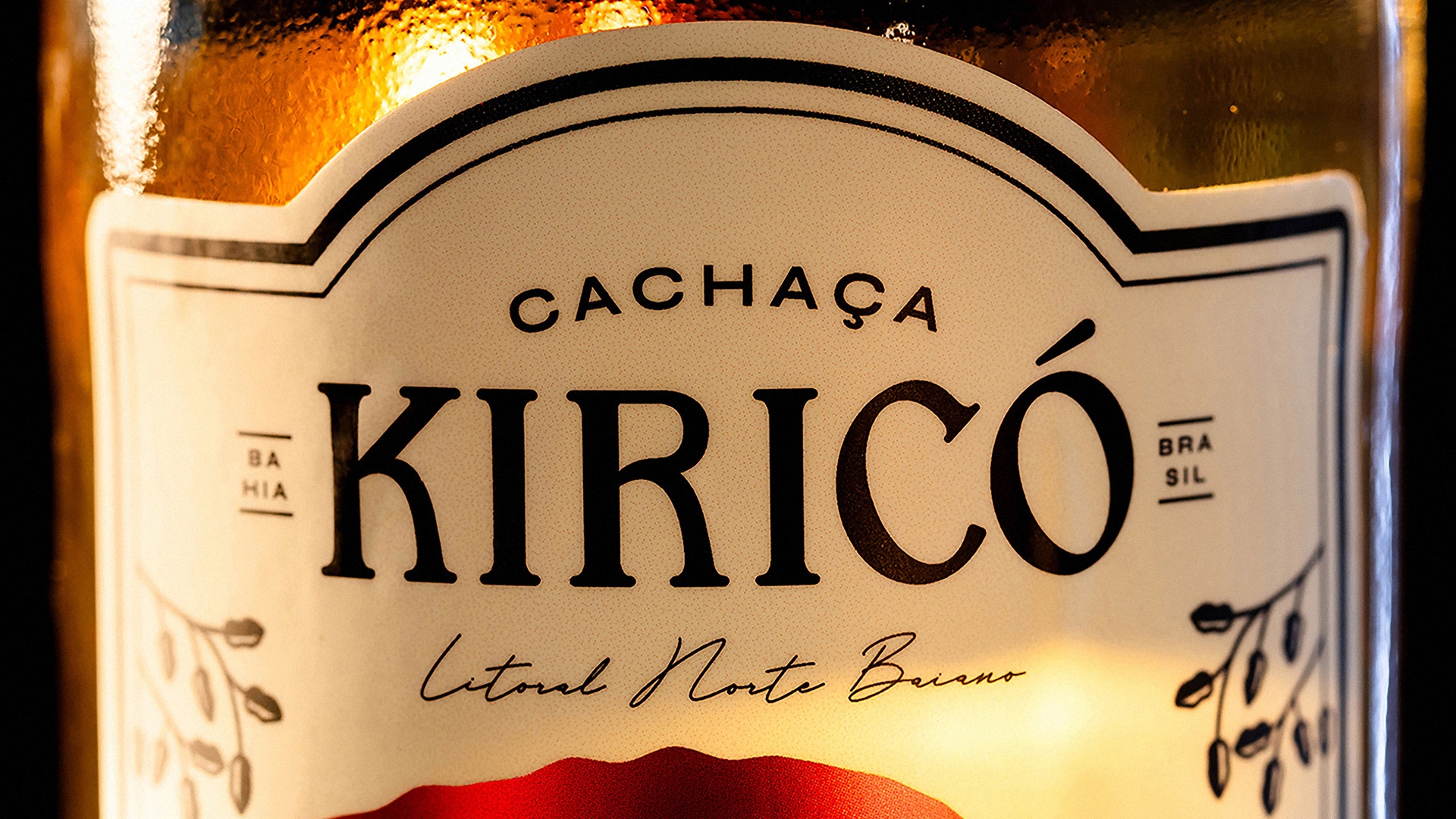
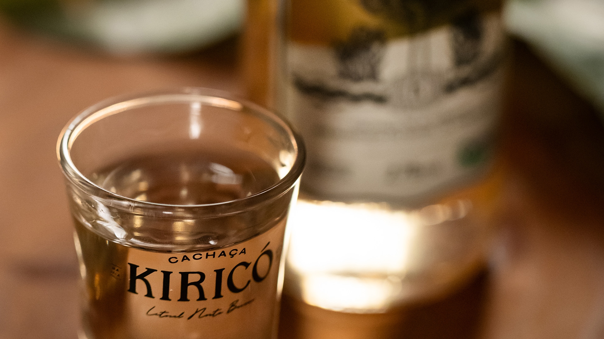
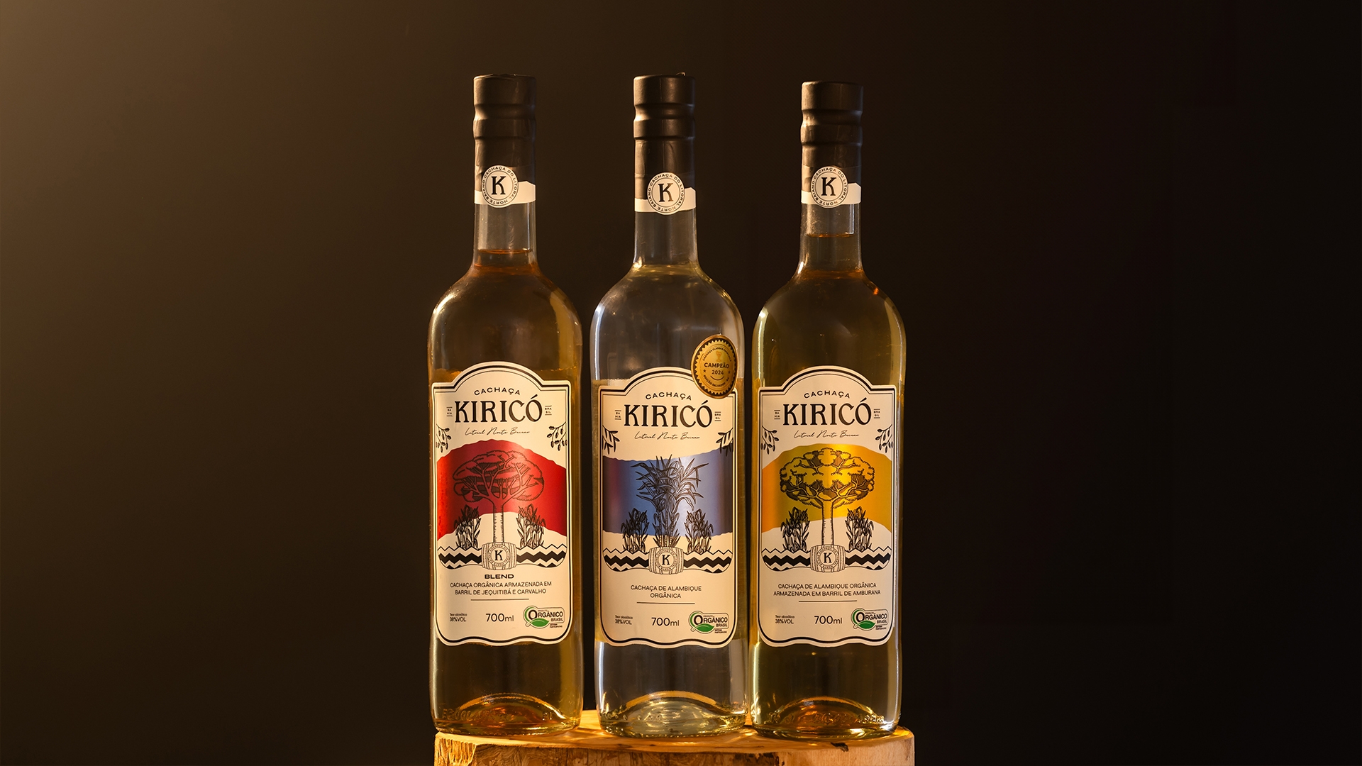
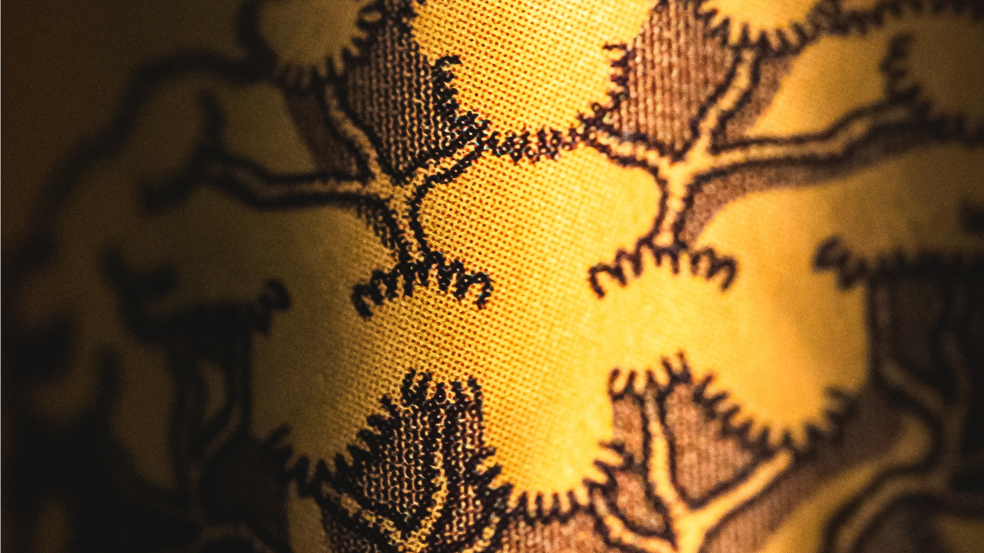
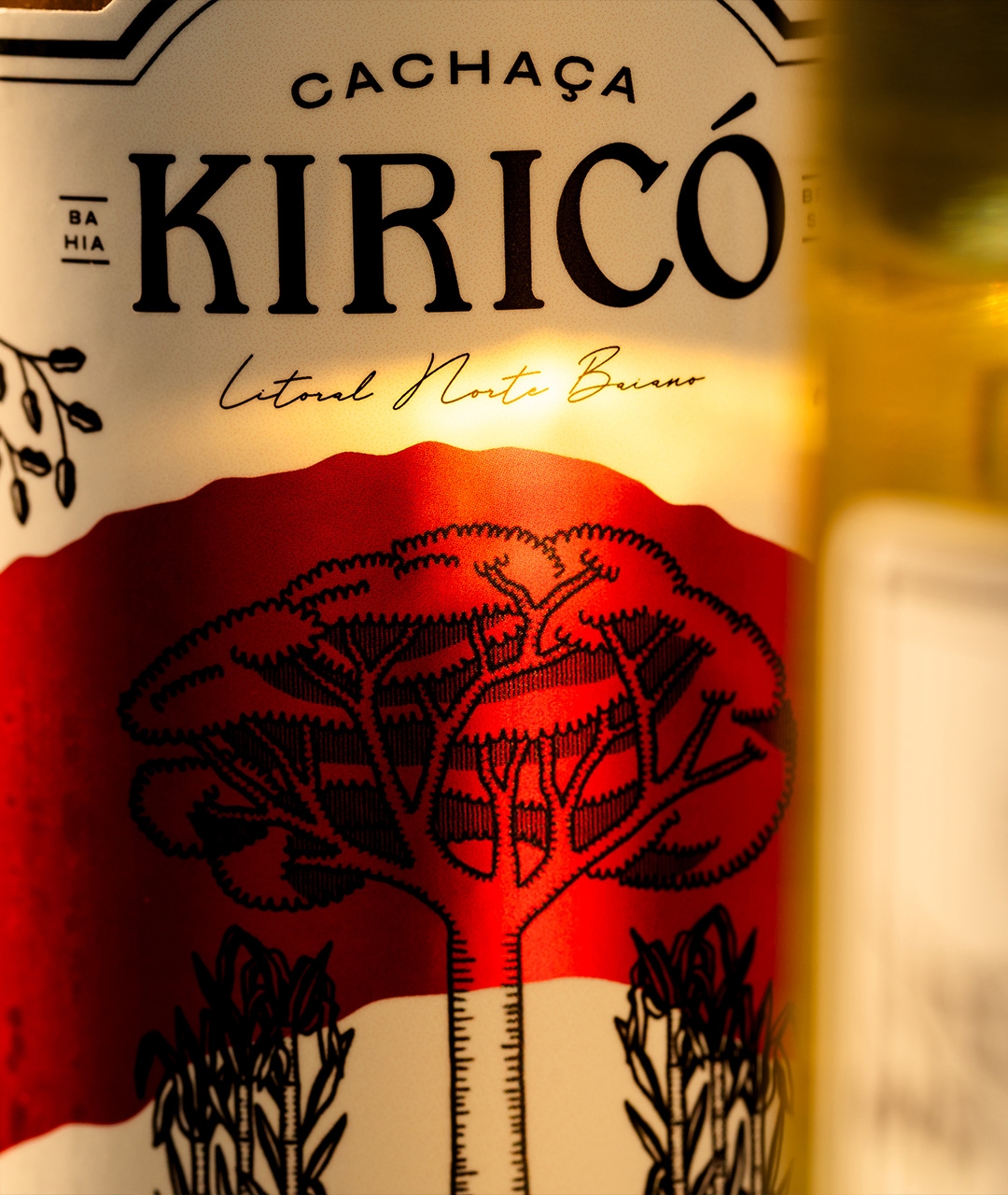
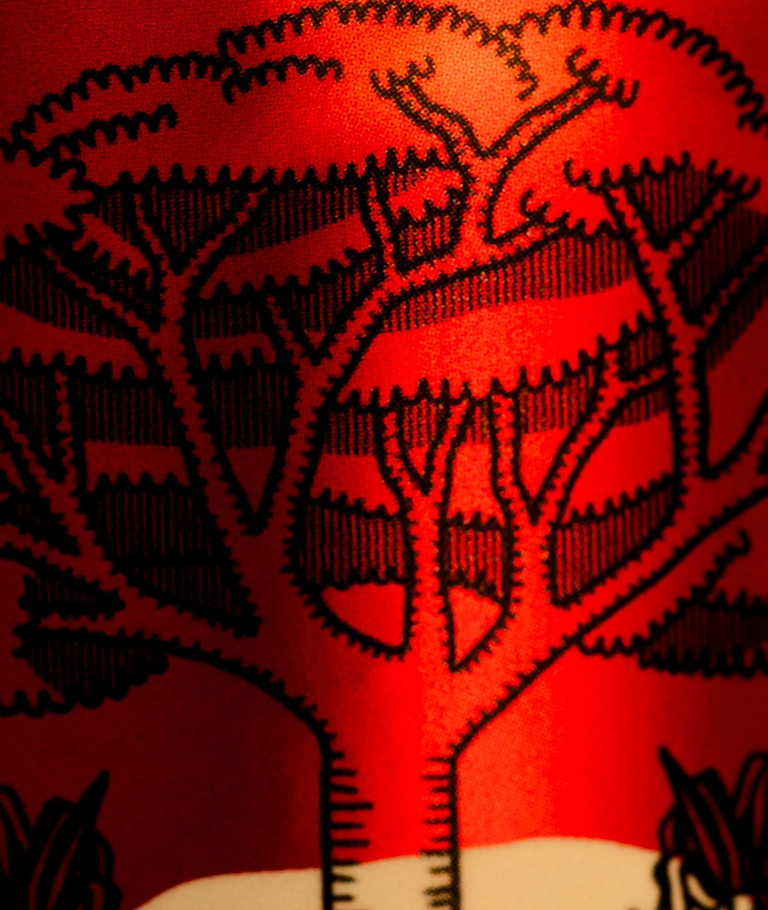
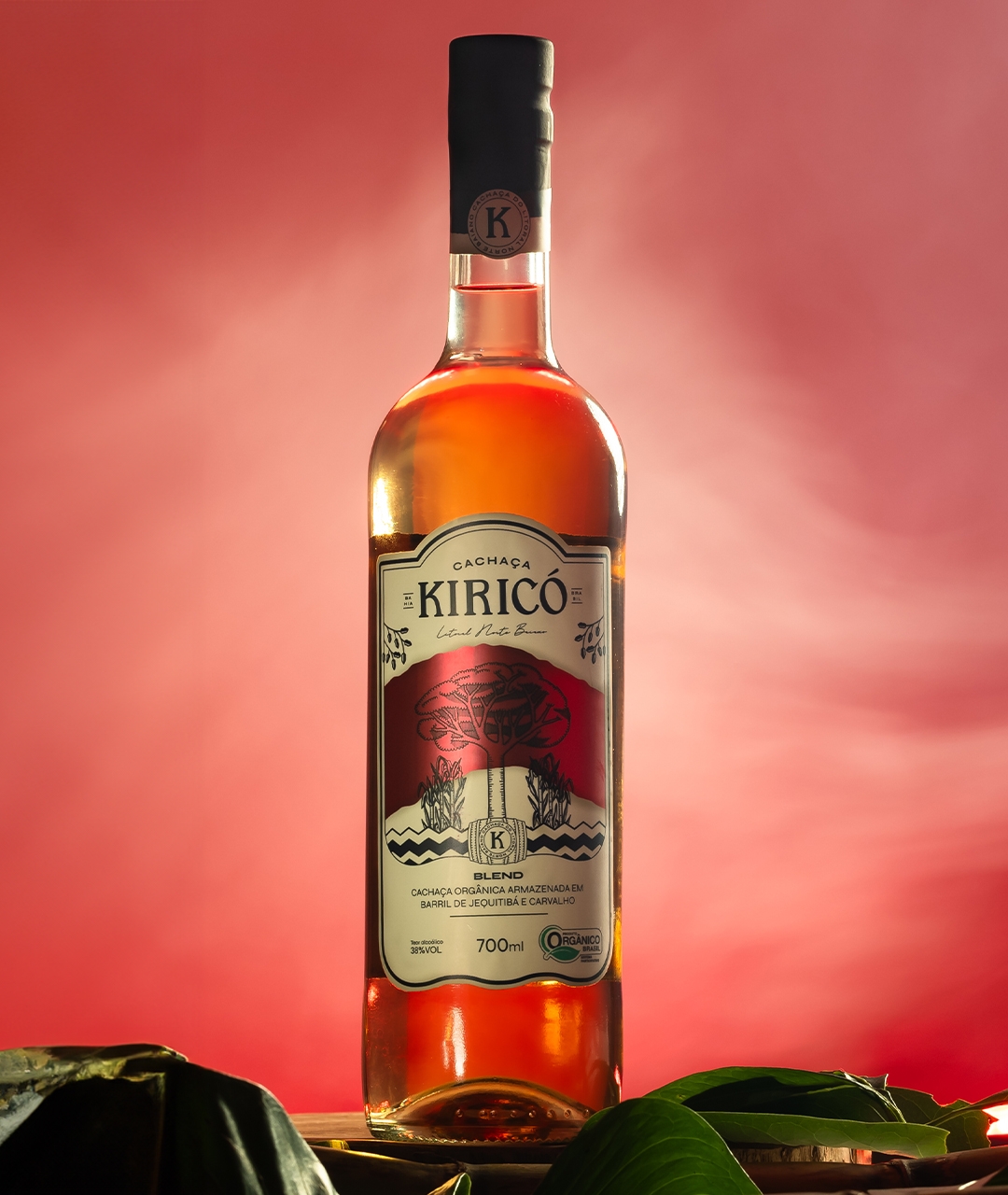
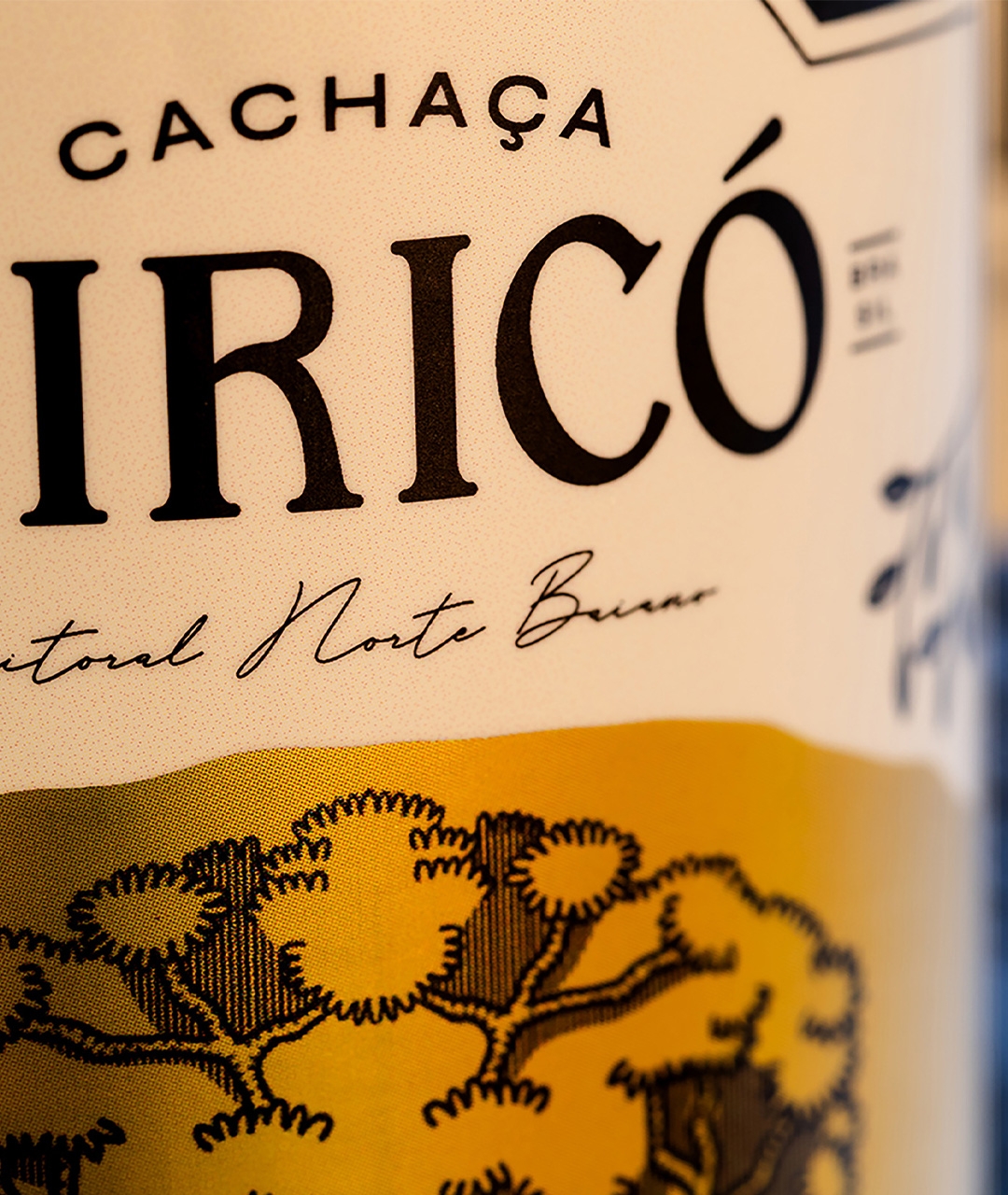
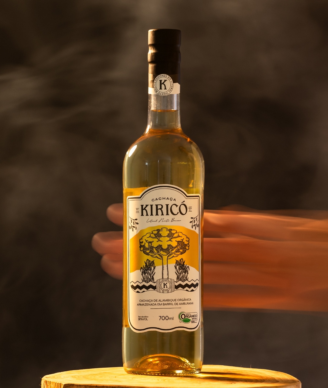
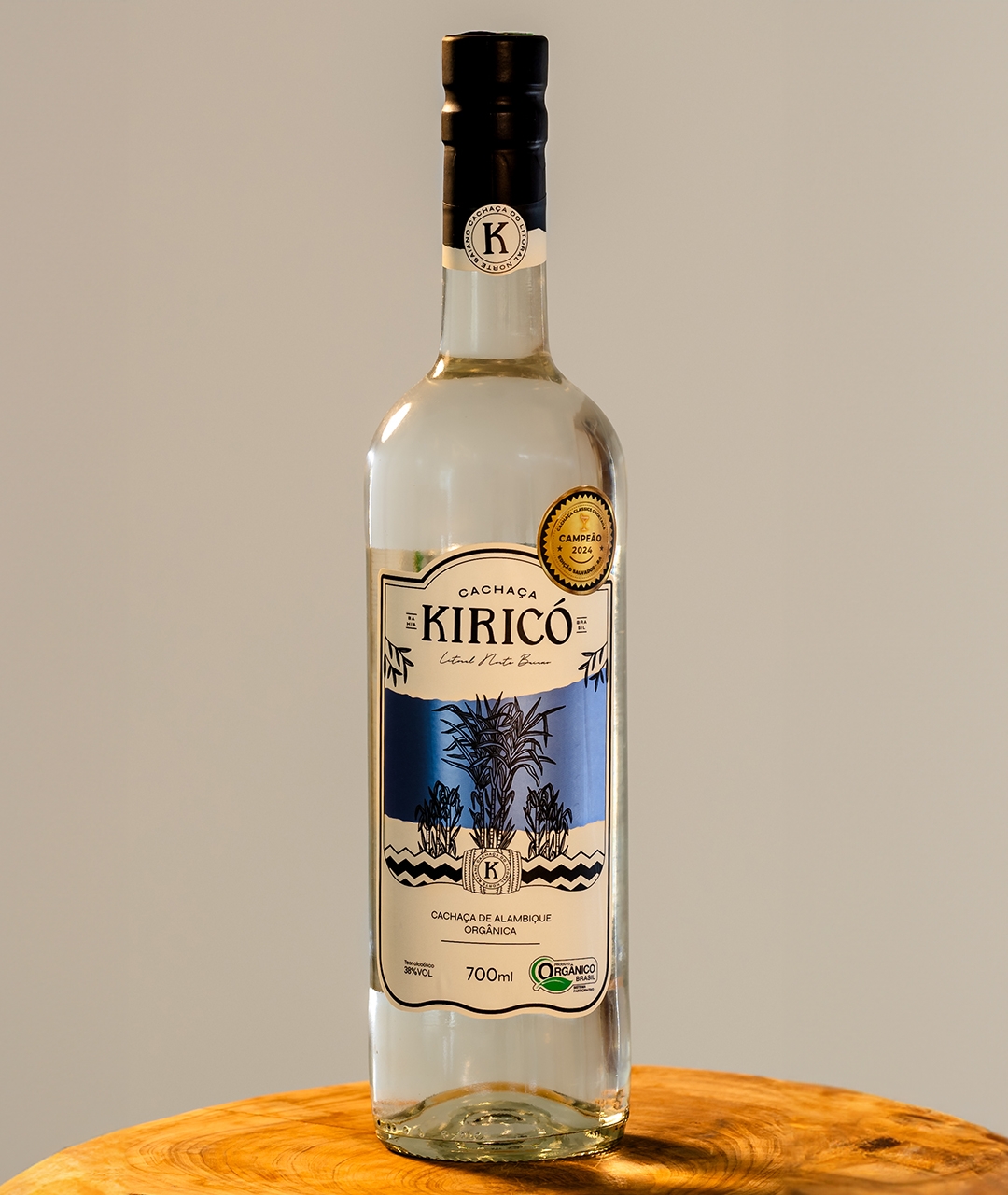
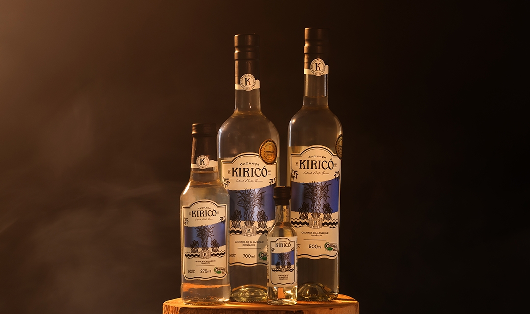
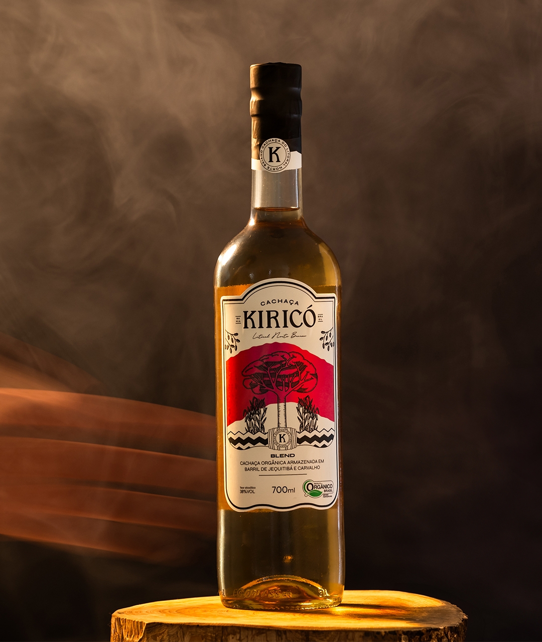
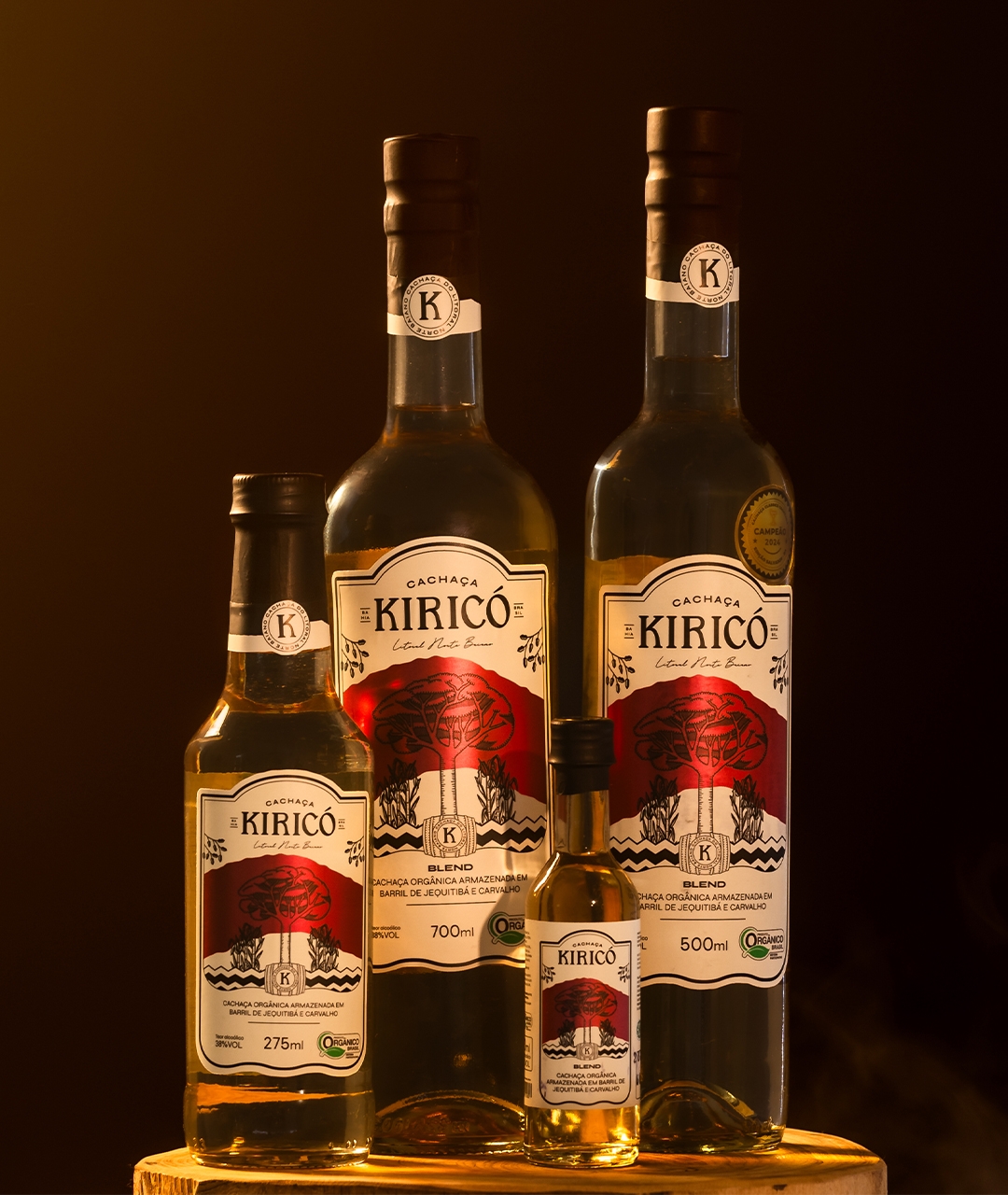
The new packaging features custom typography, colors that highlight the drink, and illustrations that evoke nature, paying homage to the trees that lend personality to each flavor. Each bottle showcases a section of the Kiricó River, which flows through the farm on the coast of Mata de São João, Bahia.
The recipe, a legacy of five generations, reflects the cultural richness of the region. Thus, Kiricó renews its identity, honoring its roots and inviting people on a sensory journey through the tradition and innovation of Bahian artisanal cachaça.


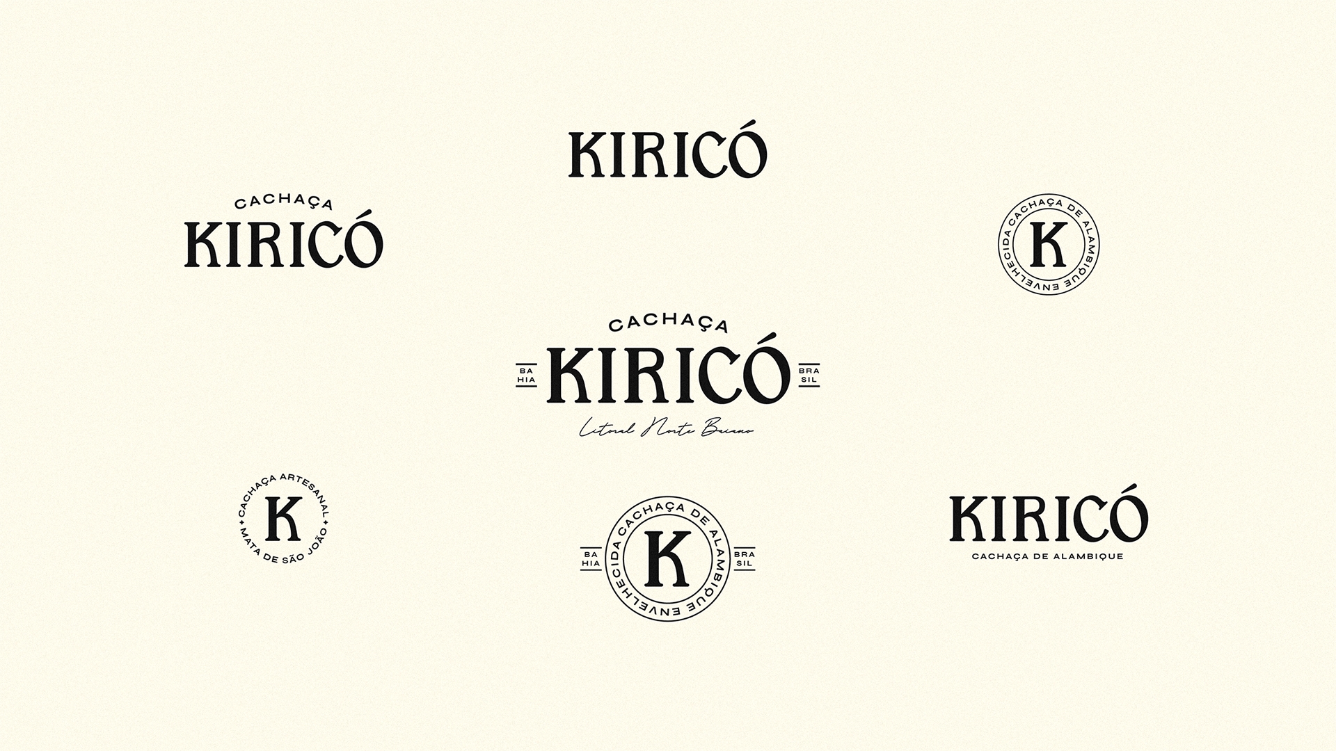
Kiricó Cachaça, an artisanal product from the northern coast of Bahia, has refreshed its visual identity to appeal to a more sophisticated audience. A proprietary typography was developed, combining elegance and versatility while preserving the brand’s essence, marking the first significant change in almost a decade.
A label was created for each flavor, graphically highlighting the tree that characterizes the flavors, aromas, and textures of each drink. This also serves to exalt the natural ecosystem that surrounds the brand and its product.
The standout element is the representation of the Kiricó River in metallic paper. Each bottle displays a section of the river in colors that harmonize with the drink, and when aligned, they form a representation of the river that gives the company its name.

Kiricó Cachaça innovates in a still underexplored artisanal market. Recognizing the niche’s potential, the brand has refreshed its visual identity to reach its audience of connoisseurs and enthusiasts. In a landscape dominated by small family producers, Kiricó uses its new labels as an expansion strategy, aligning presentation with the quality of its unique flavors.
The visual refresh elevates the brand, with custom typography and exclusive labels that celebrate nature and regional culture. This project reaffirms its commitment to quality and authenticity, meeting the demand for complete sensory experiences.
Each Kiricó bottle becomes a visual narrative of the namesake river and its traditions, connecting with a market that values authentic stories and deep roots.

The Kiricó Cachaça project was based on extensive research into local producers in northern Bahia, their manufacturing methods, and packaging. The new visual identity, developed from this study, stood out at regional fairs, placing the brand in a prominent position.
Understanding family farming and the target audience was key to the project's success. The new packaging, with elements that honor nature and local culture, strengthened the brand's connection to its roots.
As a result, Kiricó expanded into international markets, including Portugal and Germany. The new visual identity not only elevated the brand's perception but also served as an inspiration for other producers in the region, demonstrating the transformative power of design.