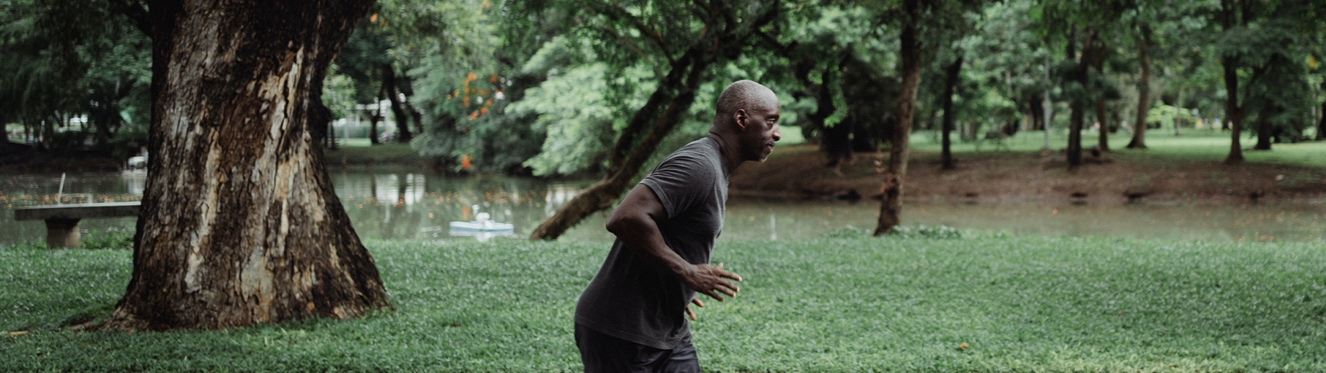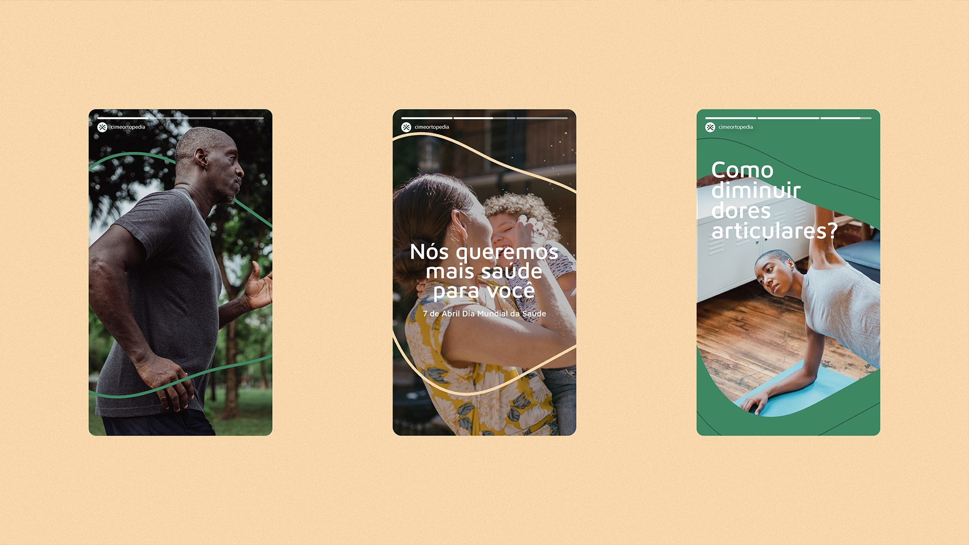

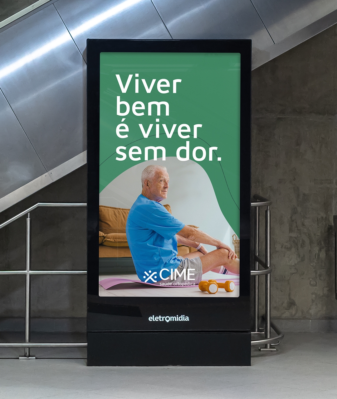
Move freely without feeling pain

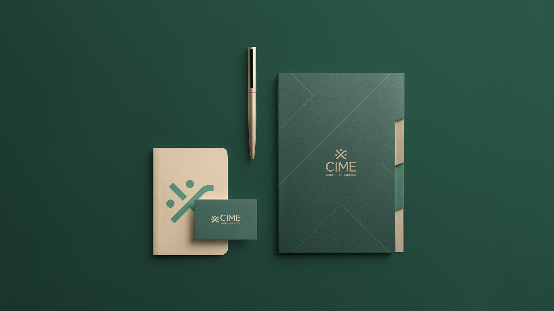
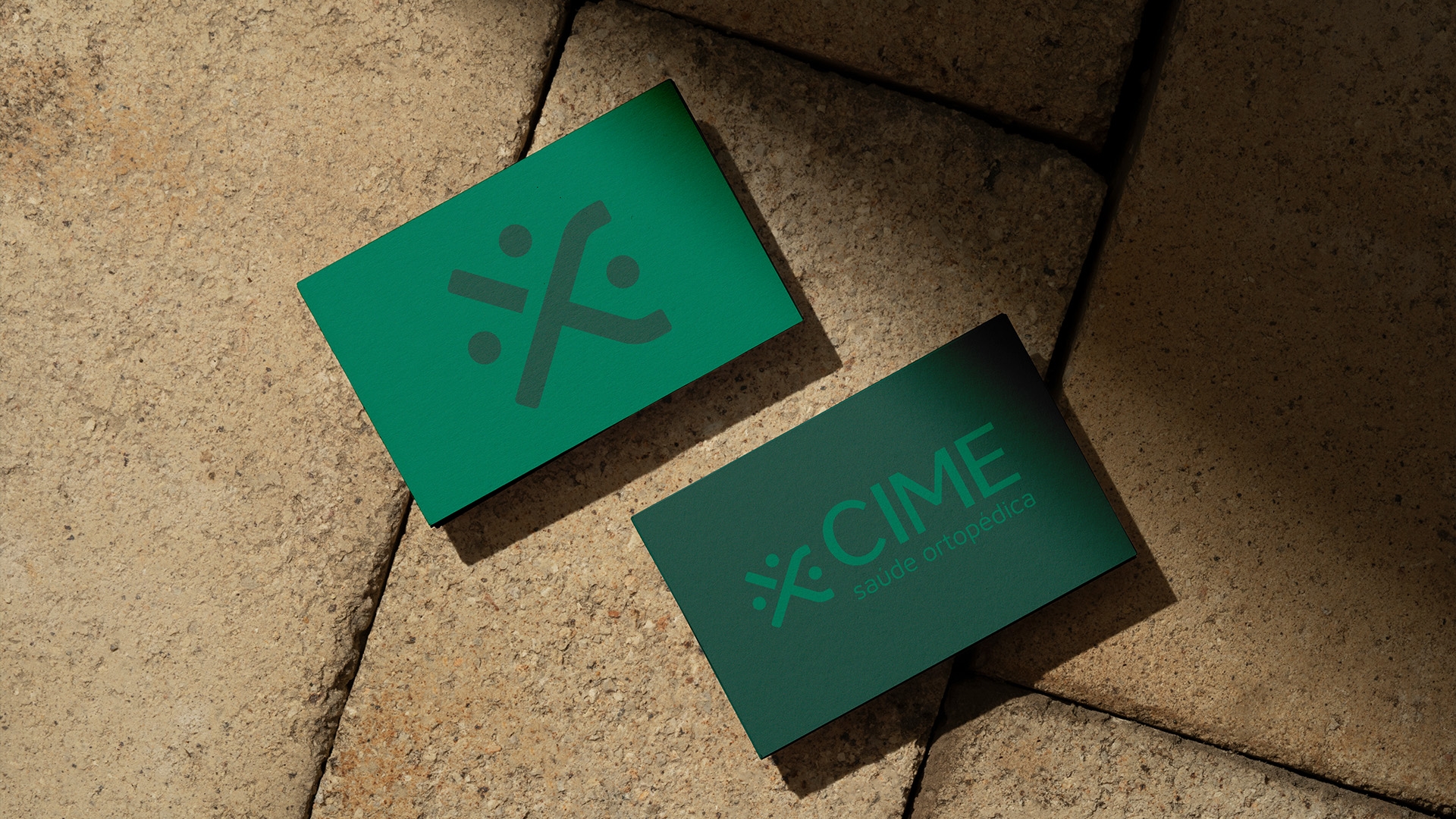
The construction of its visual identity is the result of the multiplication of three central concepts.
The first evidences the feeling of exchange between doctor and patient. One of CIME's proposals is to take care of people so that they can move freely, this demands proximity between the two parts of the process. To discover how we could visually represent this meaning, we emerged in the universe of the problem and found in the ligaments between bones and muscles an interesting graphic representation for the construction of the symbol.
The second concept extols humane treatment: Concept linked to CIME that gets to the root of the problem, at the origin of pain, looking at each individual as a whole person and not just as a part of the body.
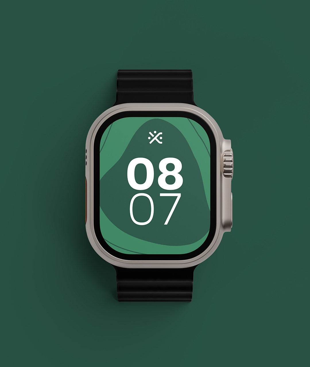
To complete the construction of the logo, we bring the feeling of movement. We are movement. We have a body to take us where we want to go, and to enable us to do what is necessary to live well. This is what CIME believes and what we are able to represent in its identity.
To complete the construction of the logo, we bring the feeling of movement. We are movement. We have a body to take us where we want to go, and to enable us to do what is necessary to live well. This is what CIME believes and what we are able to represent in its identity.


This is an idea of freedom that CIME offers its patients.