food muuuuuy caliente, and next to you.
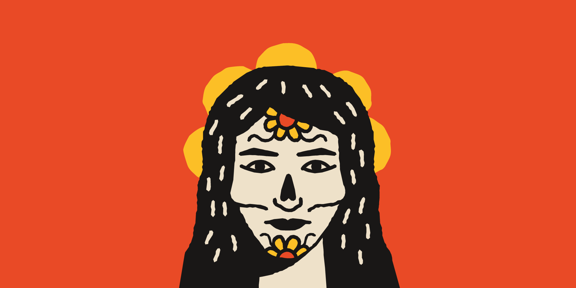

In the desire to build a real link between the restaurant and its Mexican roots, we found inspiration in the art of José Guadalupe Posada (1852-1923) and his constant reinforcement of a Memento Mori. Famous for its lithographs, Guadalupe presents “La Catrina” - A representation of the skeleton of a high society lady with her floral adornments and embellishments.
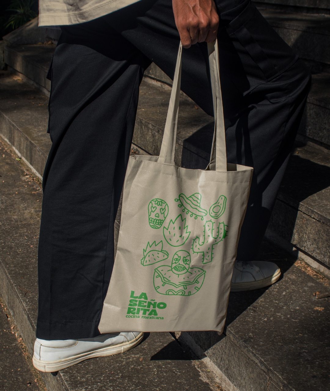
Understanding death as an inherent condition of life, and encouraged by this contrast, our research led us to Frida Kahlo - a historical figure of extreme importance for female representation, which highlights the fact that the restaurant's team is made up of women. Motivated by her paintings, we bring an illustration of a woman in frontal perspective to represent the La Señorita brand.
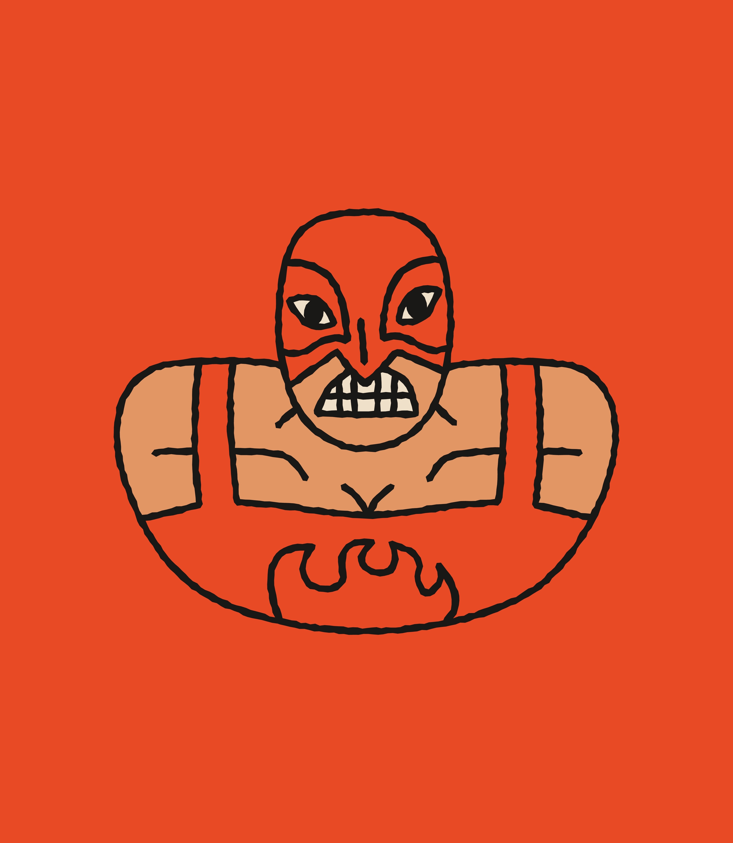
The construction of this symbol contains flowers on the face as the symbolism of a festive moment; a flower behind the head that brings an almost sacred air to the composition; lines that imitate the structure of a skeleton; and the vibrant cores that are found at the same time in historical pieces of weaving and in the striking seasonings of Mexican cuisine.

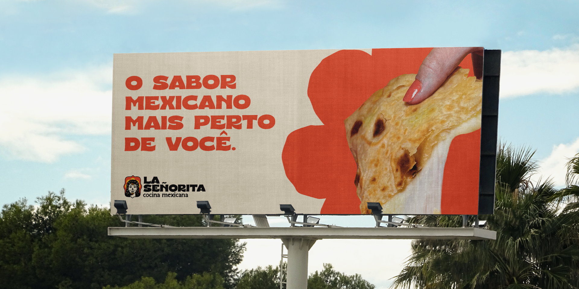


To bring the entire expression of La Señorita to life, we worked with colors that range from the light green of avocado, the rich yellow of turmeric and the fiery orange of pepper. And to make things more exciting, we built a mixed language that combines regional expressions from our beloved Hermanos with words in Portuguese, representing the true Tupiniquim behavioral aspect of Brazilianizing things a little.
In this way we find a perfect balance between a light brand with every path open to quality and sophistication.