
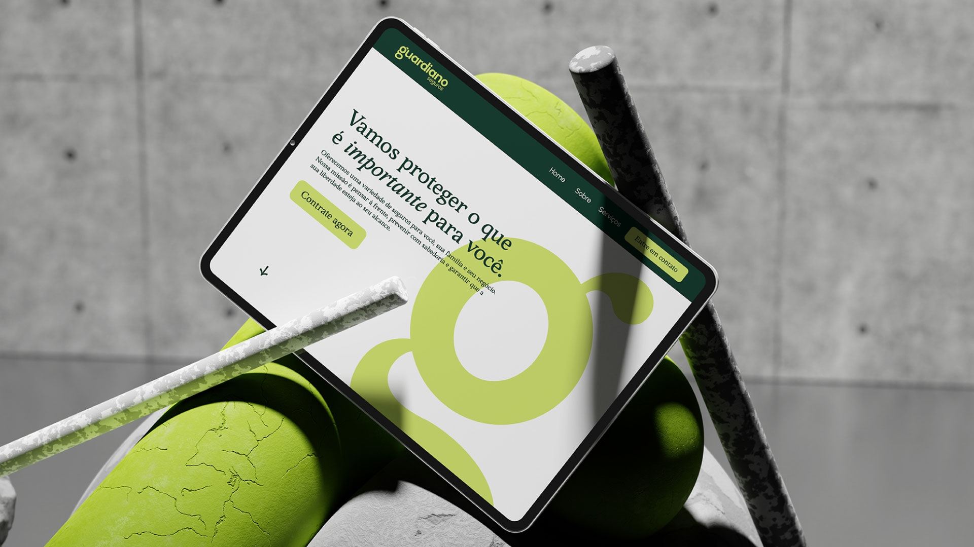
Bringing humanity and personalization to the insurance industry, Guardiano talks about the culture of prevention and the true value of freedom. Our challenge was to build a current brand that talks about insurance in a democratic and confident way, and translate, through energetic and personal language, its central positioning: protecting what is important to you.
To bring this message to life, we developed a visual and verbal universe that embraces simplicity and conveys the message efficiently. Without beating around the bush.
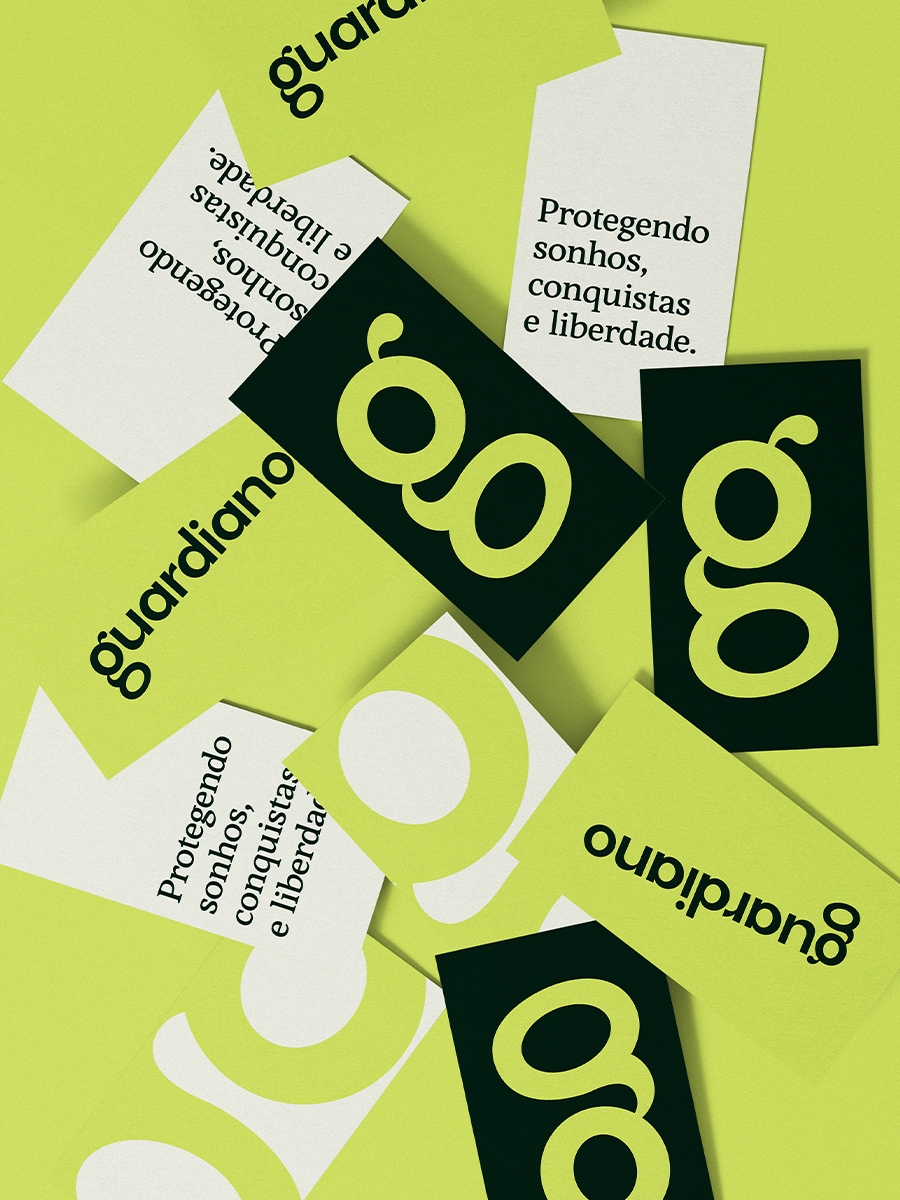
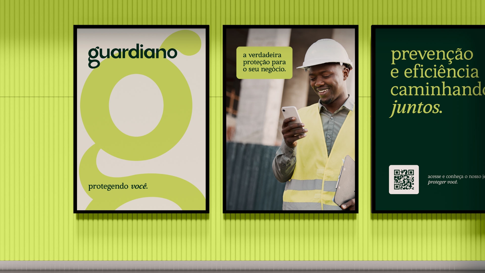
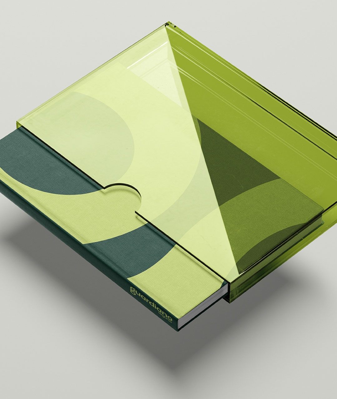
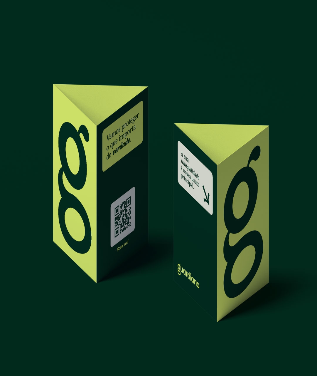
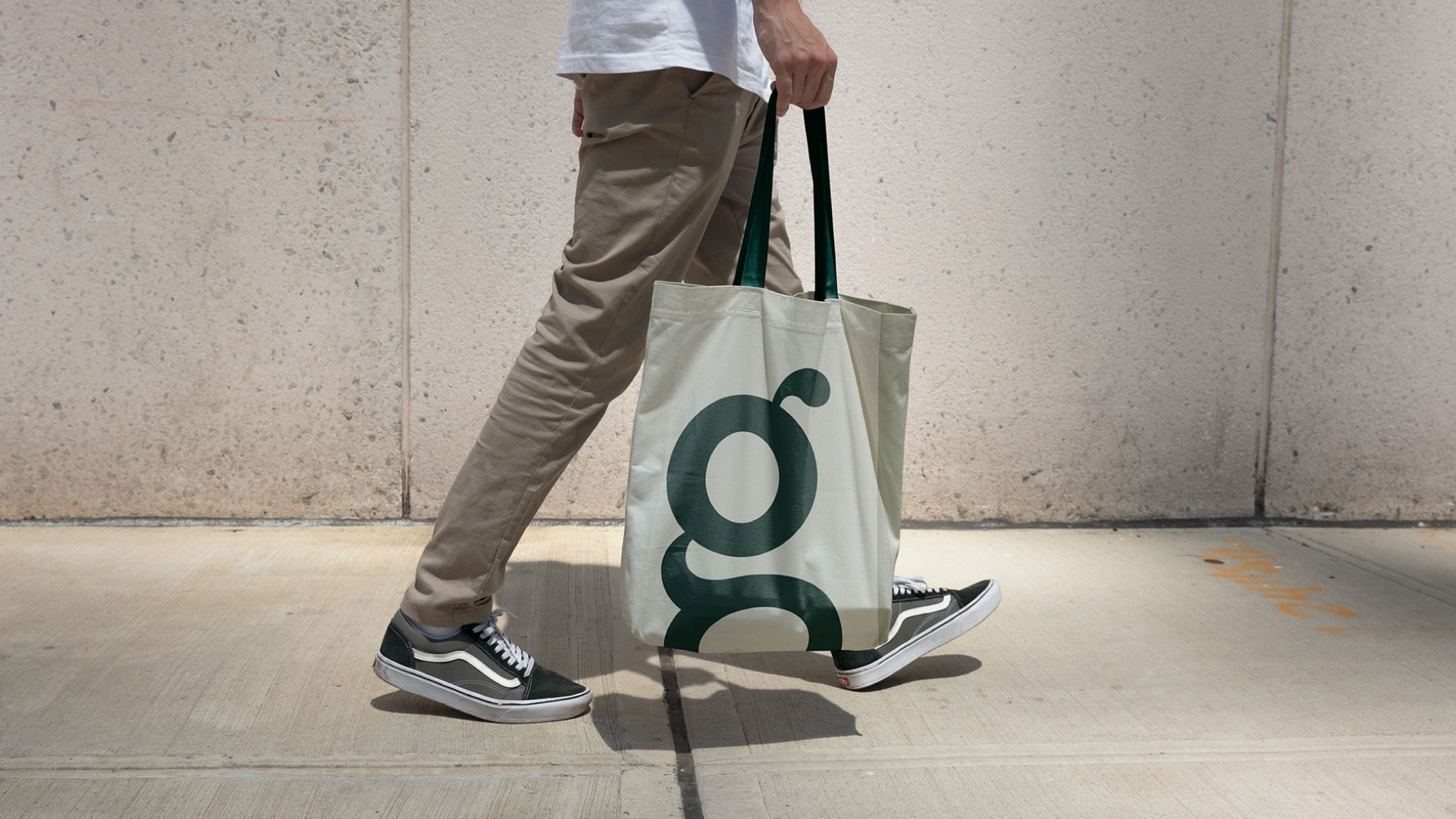
The Guardiano Seguros brand is presented through proprietary typography that communicates its message with clarity and authenticity. The base of its construction brings humanistic characteristics and unique curves. Without serifs and written in lowercase letters, the logo became a synthesis of the company's positioning. This way, talking about insurance in Brazil can become simpler and more democratic.
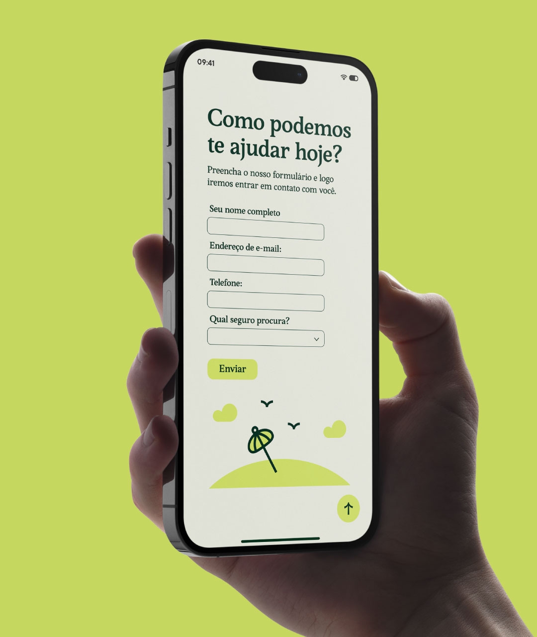
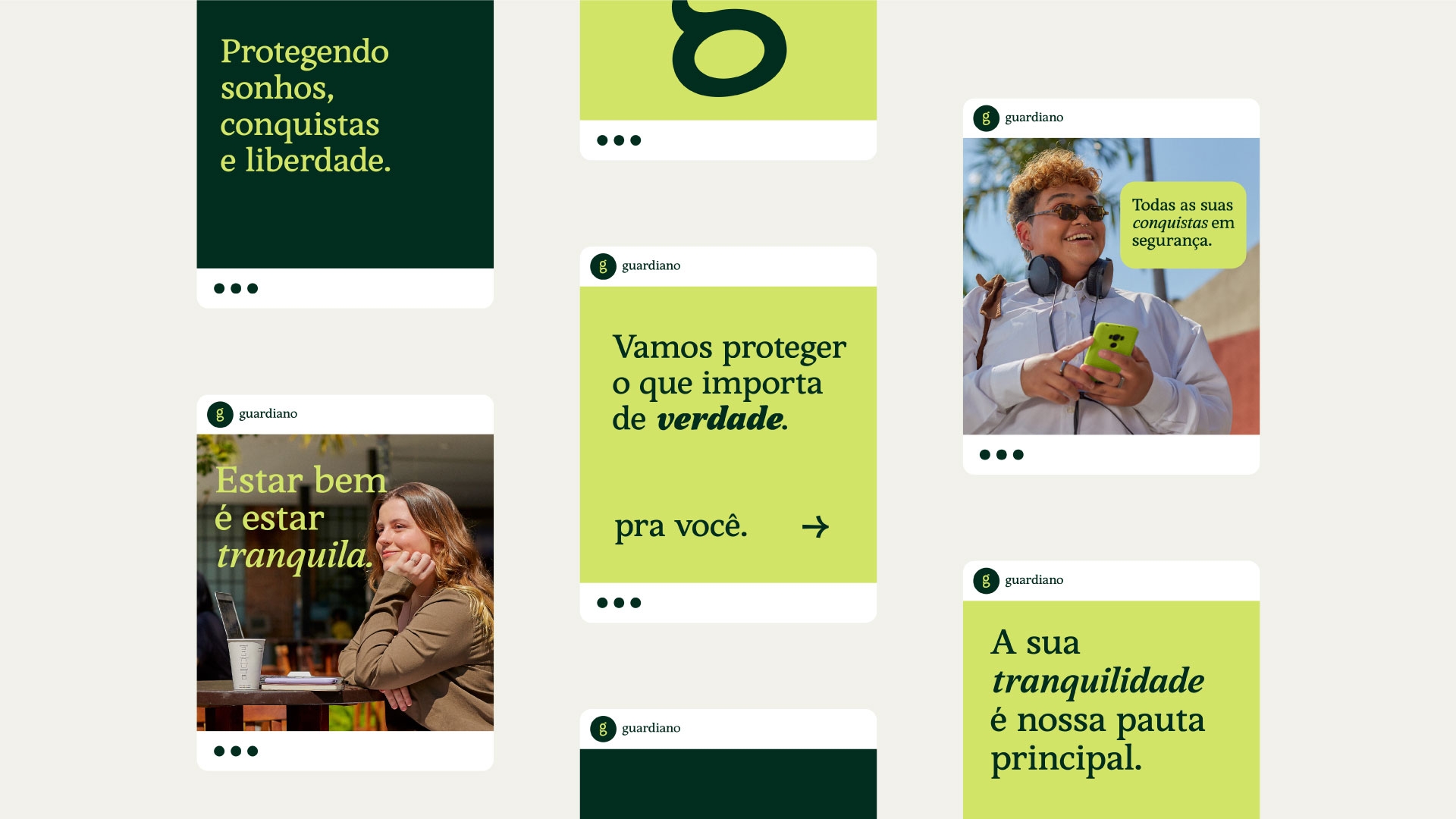

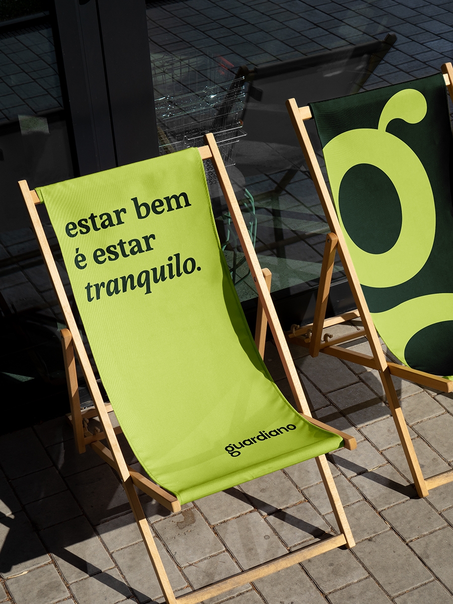
The brand's tone of voice is familiar and compassionate. Thus, Guardiano speaks with closeness, bonding and empathy, but without losing coherence and security when conveying a message.
Verbal expressions act in the rhythm of a dialogue where the interlocutor is the central element. To bring this tone of voice to life, we brought expressions that carry confidence, like a conversation with a close friend.

In the never-ending journey of protecting the meaning of dreams and achievements, Guardiano stands as a protector. It is a brand that passionately believes in the value of intangibles and freedom.